
Like, Coca Cola needs to look like Coca Cola. Apple needs to look like Apple. Sure. But me posting on Instagram, TikTok, LinkedIn, Pinterest… why would it matter if one post looks a little different?
Then I looked back at three months of my own content and it honestly felt like five different people were running my accounts.
One week it was clean minimal graphics. Next week it was loud templates. Then a random Canva font phase. Then I tried AI images and everything suddenly looked like a sci fi book cover for no reason.
And the worst part is that AI makes this easier to mess up, not harder. Because you can generate 50 designs in an hour. Cool. But if those 50 designs don’t share a visual language, you just made 50 pieces of noise.
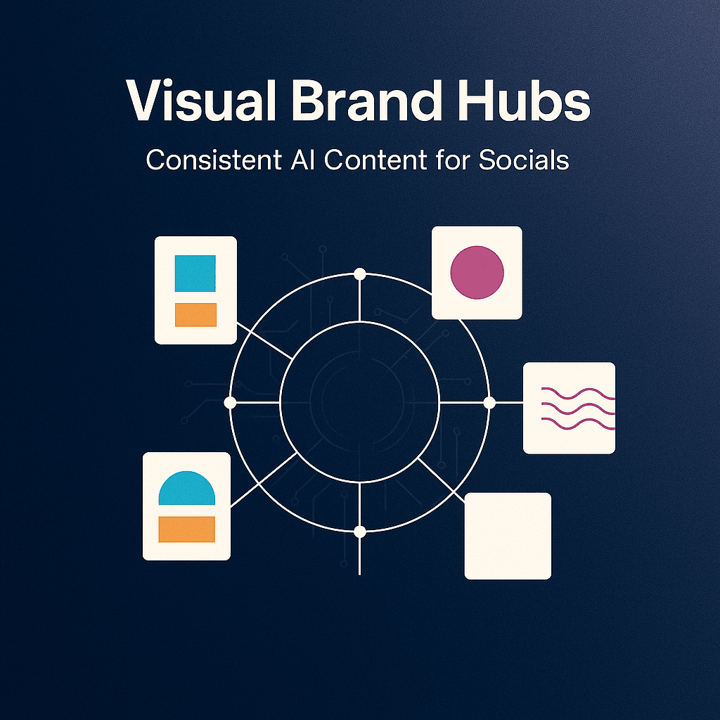
That’s where a Visual Brand Hub comes in.
Not a “brand kit” that lives in a folder you never open. I mean a working system that sits between you and the chaos. A central place where your visual rules live, your AI prompts live, your templates live, your examples live. So everything you post still looks like you, even when AI is doing half the heavy lifting.
Let’s build that.
What a Visual Brand Hub actually is (in plain language)
A Visual Brand Hub is basically your brand brain, but for visuals.
It is one source of truth that answers questions like:
- What colors do we use, specifically?
- What fonts, specifically?
- What kind of photos do we use?
- What kind of AI images do we generate, and what do we avoid?
- What do our thumbnails look like?
- What does a carousel cover look like?
- How do we place text on images?
- How do we keep this consistent across Instagram, TikTok, LinkedIn, YouTube, Pinterest?
And here’s the key.
A Visual Brand Hub is not just rules. It is examples plus reusable building blocks.
Rules without examples are ignored. Examples without reusable blocks become “inspiration” and you still reinvent everything every time.
So the hub needs both.
Why AI makes consistency harder (unless you systemize it)
AI is amazing at variation.
That is literally what it does. You ask for one concept and it gives you ten vibes.
But consistency requires constraints, repetition, and boring decisions you make once.
If you do not lock those decisions down, AI will happily:
- Change your lighting style every post
- Swap your color palette slightly each time
- Give you different face styles, different skin tones, different camera lenses
- Make your typography look like a different creator’s feed
- Drift your “brand voice” visually even when your captions are consistent
So the hub is how you stop the drift.
It is you saying: here are the boundaries. Now be creative inside them.
The ingredients of a Visual Brand Hub (the checklist)
You can build this in Notion, Google Drive, Canva Brand Kit, Figma, Milanote, whatever. Tool does not matter much.
Structure matters.
Here is what I’d include.
1. Your “visual identity sentence”
One sentence that describes your look, like a human would.
Examples:
- “Warm, clean, slightly playful. Like a modern notebook with sunlight.”
- “High contrast, editorial, confident. Like a magazine cover but minimal.”
- “Soft neutral palette, calm, spacious. Like a boutique wellness studio.”
This sounds fluffy but it keeps you from randomly generating cyberpunk neon posts because you got bored.
Put it at the top of your hub.
2. Color palette, but make it usable
Do not just list 3 colors. Give yourself a system:
- Primary (1 to 2 colors)
- Secondary (2 to 3 colors)
- Neutrals (2 to 4 colors)
- Accent (1 loud color max, optional)
Include HEX codes. Include do and do not examples.
Also, decide your background preference. Are you mostly light backgrounds? Mostly dark? Are gradients allowed? Are textures allowed?
AI will try to be “pretty.” Your job is to make it be “you.”
3. Typography rules (even if you mostly do video)
Pick:
- One headline font
- One body font
- One optional accent font (only if you are disciplined)
Then define:
- Headline casing (ALL CAPS or Title Case or Sentence case)
- Corner radius style if you use boxes behind text
- Stroke, shadow, or no shadow
- Line spacing vibe (tight vs airy)
If you do video overlays, typography consistency is half the brand. People recognize fonts faster than logos.
4. Layout patterns you repeat on purpose
This is where most creators fall apart.
They have a palette, fonts, a logo… and still every post feels random because layout changes constantly.
Pick 3 to 5 layout patterns for your core post types.
For example:
- Carousel cover: big headline top left, small subhead bottom left, icon right
- Quote graphic: centered text with a thin border, small logo bottom
- Tip graphic: numbered list, left aligned, lots of white space
- Video cover: face on right, headline on left in a solid box
Save these as templates. Your future self will thank you.
5. Your image style rules (photos and AI)
This needs to be specific. Like painfully specific.
Decide:
- Color temperature: warm, neutral, cool
- Contrast: soft vs punchy
- Saturation: muted vs vibrant
- Backgrounds: clean studio, real environments, textured paper, gradients
- Subject matter: people, objects, product shots, screenshots, illustrations
- Cropping: close up faces, mid shots, lots of negative space, etc
Then write a short “avoid list”:
- No hyper glossy 3D renders
- No overly perfect teeth and skin
- No surreal hands
- No cluttered backgrounds
- No random lens flares
- No weird fake text in AI images
And if you use AI for images, you need a prompt library. Not one prompt. A small set of prompts that always produce on brand outputs.
We’ll get to that.
6. Icon and illustration style
Are icons:
- Outline or filled?
- Rounded or sharp?
- Thick stroke or thin stroke?
- One color or multi color?
And illustrations:
- Flat vector?
- Hand drawn?
- 3D clay?
- Sketchy pencil?
Pick one lane.
7. Motion rules (for Reels, TikToks, Shorts)
Most “visual brand kits” forget motion.
But motion is the whole game now.
Decide:
- Caption style (font, size, background box or none)
- Position (lower third, centered, top)
- Highlight color for keywords
- Transition style (hard cuts, simple slides, zooms)
- B roll vibe (clean, handheld, stock footage style)
Consistency in captions alone can make your content feel instantly recognizable.
8. Platform specs and safe zones
This is boring but necessary.
Keep a small table with:
- IG post size (square, portrait)
- IG Story safe zones
- TikTok safe zones (UI overlays)
- YouTube thumbnail sizes
- LinkedIn image sizes
It prevents you from constantly resizing and messing up layouts.
The heart of the hub: your AI prompt system (not random prompts)
If you want consistent AI content, you need “prompt components” you reuse.
Think of it like LEGO.
Instead of writing a brand new prompt every time, you assemble prompts from fixed blocks:
- Style block (your look)
- Composition block (your layout)
- Color block (your palette)
- Lighting block (your lighting)
- Camera block (lens, depth of field)
- Negative block (what to avoid)
A simple example: AI image prompt template
Here is a starting template you can keep in your hub and reuse:
Prompt
Create a [photo/illustration] for a social media post.
Style: [your visual identity sentence].
Color palette: [list HEX or describe neutrals + accent].
Lighting: [soft natural light / studio softbox / etc].
Composition: [minimal background, lots of negative space, subject on right, space on left for text].
Subject: [what is in the image].
Mood: [calm, confident, energetic, etc].
Quality: crisp, high resolution, realistic textures (if photo).
Negative prompt
Avoid: text, logos, watermarks, extra fingers, distorted hands, surreal artifacts, cluttered background, harsh oversaturation, overly glossy 3D look.
You can tighten it over time based on what your generator tends to mess up.
And yes, keep the “avoid text” line. Most AI image models still produce gibberish typography and it looks cheap.
Make 5 to 10 “approved prompt recipes”
In your hub, store a small list like:
- Minimal product flat lay
- Lifestyle desk scene
- Abstract background texture
- Clean portrait style (if you do AI portraits, carefully)
- Simple icon set prompt
- Editorial photography vibe
- Soft gradient background
The goal is not infinite variety.
The goal is repeatable variety. Everything different, but still obviously yours.
The workflow that keeps you consistent week after week
A hub is only useful if it changes how you work.
Here is a workflow that actually sticks.
Step 1: Decide your content pillars and map them to visual formats
Example:
- Educational tips -> carousels
- Behind the scenes -> short videos
- Proof and results -> screenshots + commentary
- Opinion posts -> text led graphics
- Offers -> simple promo templates
Then assign each pillar a visual format and a template.
This alone removes so many decisions.
Step 2: Create a “template pack” once
Make a small set of templates:
- 5 carousel covers
- 5 carousel inner slides
- 3 quote graphics
- 3 promo graphics
- 3 video cover templates
- 1 story template for announcements
Not 50. Start small.
Put them in Canva or Figma. Lock your colors and fonts. Duplicate forever.
Step 3: Use AI for ideation and drafting, not for random design choices
This is where people get tripped up.
Use AI to help with:
- Hook ideas
- Carousel outline
- Caption drafts
- CTA variations
- Hashtag sets (lightly)
- Video scripts
But do not let AI decide your visual identity every time.
You can let it generate images within your prompt recipes. That is fine. But your layout patterns, typography, and palette should already be decided.
Step 4: Do a quick “brand check” before posting
Make a tiny checklist you can run in 30 seconds:
- Are the colors within palette?
- Are fonts correct?
- Is spacing consistent with templates?
- Does this look like it belongs in my feed?
- Are the visuals aligned with my “visual identity sentence”?
If something fails, you fix it before it ships. No negotiation.
Making it feel human (because perfect consistency can feel sterile)
Here is a weird truth.
If everything is too consistent, it starts to feel like a corporate account. And people scroll past corporate accounts.
So you want controlled consistency.
A few ways to keep it human without breaking the brand:
- Keep the same typography, but vary the photo and cropping
- Keep the same layout, but rotate background textures subtly
- Keep the same palette, but allow one seasonal accent color per quarter
- Keep a “messy” format that is still on brand, like iPhone notes screenshots using your font and colors
- Use real photos sometimes, even if they are imperfect, but color grade them to match your vibe
The hub should include permission for this. Literally write it down.
Example:
“We allow occasional raw iPhone photos. Rule: warm tone, slightly lowered saturation, keep backgrounds uncluttered.”
That is how you stay consistent and alive.
What to put in your Visual Brand Hub folder today (a practical structure)
If you want a clean structure you can copy, here:
Folder: Visual Brand Hub
01 Brand Basics
- Visual identity sentence
- Logo files (if you use them)
- Color palette (HEX, RGB)
- Typography (font files or links)
02 Templates
- Canva or Figma template links
- Export presets
- Thumbnail templates
- Story templates
03 AI Prompt Library
- Image prompt recipes
- Negative prompts
- Caption prompt templates
- Script prompt templates
04 Asset Library
- Icons
- Background textures
- Stock photo sources you like
- B roll sources
- Brand patterns
05 Examples
- 20 screenshots of your best posts
- Notes on why each one worked
- 10 competitor references (optional, but useful)
06 Specs
- Platform sizes
- Safe zones
- Export settings (PNG vs JPG vs MP4)
This sounds like a lot but you can build a version one in an afternoon.
A few common mistakes (that waste a lot of time)
Mistake 1: Making the hub too complicated
If you need to “study” your own brand kit, you will not use it.
Keep it simple. Reduce choices.
Mistake 2: Chasing trends visually every week
Trends are fine for formats and hooks.
But if your visuals change constantly, people do not recognize you. Recognition is the point.
Mistake 3: Using AI to generate final designs with text baked in
AI still struggles with clean typography in images.
Generate backgrounds, scenes, objects, textures. Then add text yourself in Canva or Figma. Cleaner. Faster. More consistent.
Mistake 4: No feedback loop
Your hub should evolve.
Every month, look at your top 10 posts and ask: what do these have in common visually?
Update the hub based on reality, not what you wish your brand looked like.
Wrapping it up
A Visual Brand Hub is not a fancy branding exercise. It is a content production system.
It lets you use AI without losing yourself in randomness.
Because the win is not “posting more.” The win is posting more while still looking like you. Sounding like you. Building that instant recognition where someone scrolls and goes, yeah that’s them.
If you build the hub this week, even a simple version, you will feel it immediately.
Less second guessing. Less redesigning. Less starting over.
And your socials start to look like a brand. Not a bunch of posts.
FAQs (Frequently Asked Questions)
What is a Visual Brand Hub and why do I need one?
A Visual Brand Hub is your brand’s visual brain—a central system that houses your visual rules, AI prompts, templates, and examples. It ensures all your content across platforms like Instagram, TikTok, LinkedIn, and Pinterest looks consistent and truly represents you, even when AI assists in creating designs.
How does AI affect brand consistency and why can it cause issues?
AI excels at generating variations, which can lead to inconsistency in your brand visuals if not managed properly. Without set boundaries, AI might change lighting styles, color palettes, typography, or imagery styles with each post, causing your brand’s visual voice to drift. A Visual Brand Hub helps lock down these decisions to maintain consistency while allowing creative freedom within set limits.
What key elements should I include in my Visual Brand Hub?
Your Visual Brand Hub should include: 1) A clear visual identity sentence describing your look; 2) A usable color palette with primary, secondary, neutral, and accent colors including HEX codes; 3) Typography rules covering headline and body fonts plus styling details; 4) Repeated layout patterns saved as templates for core post types; 5) Specific image style rules for photos and AI images along with an avoid list; 6) Icon and illustration style guidelines.
Why is having a ‘visual identity sentence’ important in a Visual Brand Hub?
A visual identity sentence succinctly captures the essence of your brand’s look—like ‘warm, clean, slightly playful’ or ‘high contrast, editorial, confident.’ This helps prevent random or off-brand design choices (like unexpected neon cyberpunk posts) by keeping you focused on the intended mood and style throughout all content.
How can I maintain consistent typography across different social media platforms?
Choose one headline font and one body font (plus an optional accent font if disciplined), then define specific rules such as headline casing (ALL CAPS or Title Case), corner radius styles for text boxes, stroke or shadow usage, and line spacing. Consistent typography is crucial as people recognize fonts faster than logos—especially important for video overlays.
What role do layout patterns play in brand consistency?
Layout patterns are essential for preventing randomness in your posts. By selecting 3 to 5 layout templates for core post types—like carousel covers with specific headline placements or quote graphics with centered text—you create a recognizable and cohesive feed. Saving these as reusable templates saves time and reinforces your brand’s visual language.