
You open your bank balance, notice cash is tight. You check the sales report, realize conversions dropped two weeks ago. You look at support tickets, see a spike. Then you scramble. Fix the thing. Patch the leak. Move on.
And honestly that is normal. It is also expensive.
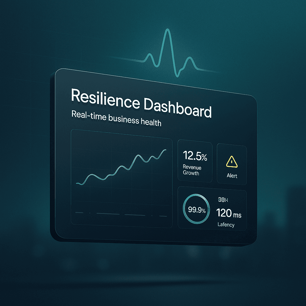
A resilience dashboard is basically the opposite approach. It is a living, real time view of how your business is actually doing across the areas that keep it alive. Not just revenue. Not just website traffic. The stuff that quietly predicts trouble. Inventory drift, margin compression, churn risk, delivery delays, incident volume, vendor dependence, customer sentiment, cash runway. The early signals.
It is not meant to be pretty. It is meant to be useful on a bad Tuesday.
This post breaks down what a resilience dashboard is, what to include, how to build one without turning it into a giant analytics project, and how to use it week to week so it actually changes outcomes.
What a “resilience dashboard” really means
When people hear dashboard, they think charts. Executive KPIs. A screen in the office that no one looks at after week two.
Resilience is different. It is about staying functional when conditions change.
A resilience dashboard answers questions like:
- Are we about to run out of cash if next month is weird?
- Is customer demand shifting faster than we are noticing?
- Is one vendor outage going to stop fulfillment?
- Are we building operational debt that will blow up later?
- Are we seeing more quality issues than usual, and where?
- If a key person is out for two weeks, what breaks?
So yes, it includes performance metrics. But it leans heavily toward leading indicators. The stuff that changes first.
If your business were a body, revenue is like weight. Useful, but slow. Resilience metrics are more like heart rate variability, blood pressure, sleep quality. Not glamorous. Very predictive.
Why most dashboards fail in practice
A lot of dashboards fail because they are built for reporting, not decision making.
Here is what tends to happen:
- Teams pull every metric they can.
- They build a giant dashboard.
- People glance at it, feel slightly informed, and then go back to Slack.
- Nothing changes.
Or worse. The dashboard becomes a scoreboard that people argue about. “Traffic is up.” “But conversion is down.” “But revenue is flat because AOV changed.” Meanwhile the real issue is fulfillment is slowing, refunds are creeping up, and the paid channel is hiding it.
A resilience dashboard works when it does a few things really well:
- It is small enough to check daily.
- It is tied to specific actions.
- It includes thresholds and alerts.
- It shows the whole system, not one department.
That is the bar.
The core idea: monitor health across six systems
You can model business health in a lot of ways, but I keep coming back to six systems that show up in almost every company, whether you sell software, services, or physical products.
- Cash and liquidity
- Demand and revenue quality
- Customer experience and retention
- Operations and delivery capacity
- People and execution bandwidth
- Risk and dependencies
You do not need 40 metrics per system. You need a handful that tell the truth quickly.
Below is a practical set that works for many businesses. You can copy it and then adjust.
1. Cash and liquidity (the “can we survive a shock” view)
Cash is not just a finance metric. It is resilience in its most literal form.
What to monitor in real time or near real time:
- Cash balance (daily)
- Sounds obvious. Still gets ignored.
- Runway (weeks or months)
- Based on current burn or average net cash outflow.
- AR aging (if you invoice)
- Especially 30, 60, 90+ days. Aging is a leading indicator of future pain.
- Payables due in next 14 / 30 days
- This is where surprises show up.
- Gross margin trend (weekly)
- Margin compression is silent. It looks fine until it is not.
- Refunds and chargebacks (daily or weekly)
- A spike here often precedes reputation issues and ad account problems too.
A small but powerful addition:
A “cash stress test” widget. Something like: “If revenue drops 20% next month, runway becomes X.” You can update it weekly. It keeps leadership honest.
2. Demand and revenue quality (not just “sales”, but stability)
Revenue is not all equal. Some revenue is sticky. Some is fragile. Some is basically a loan from the future.
Key metrics:
- Bookings or sales (daily/weekly)
- Sure. But pair it with quality.
- Pipeline coverage (if B2B)
- Pipeline to target ratio for the next 30 to 90 days.
- Conversion rate by channel (daily/weekly)
- Not just overall conversion. You want to know what changed where.
- CAC and payback period trend (weekly/monthly)
- A resilience dashboard should show if growth is getting more expensive.
- Revenue concentration
- Percent of revenue from top 1, top 5, top 10 customers. High concentration is not bad. It is just a risk that should be visible.
- Discount rate trend
- If discounting is creeping up to maintain volume, that is a signal.
One metric I like a lot:
“New revenue vs expansion vs churned revenue.” It tells you if you are growing by adding new demand or just sprinting to replace leaks.
3. Customer experience and retention (where weak signals show early)
Customers complain before they leave. They also leave quietly. The dashboard should catch both.
Metrics that actually matter:
- Churn (logo churn and revenue churn)
- Track both. They tell different stories.
- Net revenue retention (if SaaS)
- A very compact health score.
- Repeat purchase rate (if ecommerce)
- A resilience indicator. Repeat buyers are a shock absorber.
- Time to first value (onboarding)
- If this slips, churn follows.
- Support volume and backlog (daily/weekly)
- Include open tickets and aging, not just number created.
- CSAT and complaint themes
- Themes matter more than averages. You want “top 3 complaint categories this week”.
Add a simple sentiment signal:
Star rating trend, NPS, review volume, social mentions. Not because it is perfect, but because it catches problems you do not see in spreadsheets.
4. Operations and delivery capacity (can we fulfill what we promise)
This is where a lot of “healthy looking” businesses are actually fragile.
Revenue can look good while ops is breaking. Then it hits all at once. Delays, refunds, churn, reputation. You know the cycle.
Operations metrics to include:
- Cycle time / lead time
- For services, time from kickoff to delivery. For product, time from order to ship. For SaaS, time from request to resolution.
- On time delivery rate
- Simple. Brutal. Useful.
- Defect rate / rework rate
- Bugs, returns, project rework, failed QA. Whatever “quality” means in your business.
- Capacity utilization
- Not just “are people busy”, but do we have slack for surprises?
- Inventory health (if physical goods)
- Stockouts, days of inventory, slow movers, backorder rate.
- Incident volume (if tech)
- Outages, severity, mean time to recovery.
A resilience dashboard should make bottlenecks visible before they become emergencies.
5. People and execution bandwidth (the system everyone forgets)
This one is uncomfortable, because it forces you to admit that execution is a finite resource.
If your business depends on three heroes, it is not resilient. It is just lucky.
Metrics that help, without turning it into HR theater:
- Attrition and regretted loss
- Track it monthly, but show it clearly.
- Hiring pipeline for critical roles
- Not total headcount. Critical roles only.
- Work in progress limits (WIP)
- If every team has too many active projects, resilience drops. Multitasking looks like productivity until it doesn’t.
- On call load / after hours work (if relevant)
- Burnout is an operational risk.
- Single points of failure list
- This can be a simple table. “If X is out, what breaks.” Update quarterly.
This section of the dashboard is less about judgement and more about seeing strain early.
6. Risk and dependencies (what can take us down)
This is the part that gets skipped because it is not “performance”.
But resilience lives here.
Include things like:
- Top vendor dependencies and status
- Payment processor, cloud provider, ad accounts, shipping carrier, key suppliers.
- Security posture basics
- Open critical vulnerabilities, patch cadence, backup success rate.
- Compliance deadlines
- Renewals, audits, certifications, tax filings. The boring stuff that can become existential.
- Fraud and anomaly signals
- Login anomalies, transaction fraud rate, unusual refund patterns.
You are not trying to predict every disaster. You are trying to avoid being surprised by the obvious ones.
What the dashboard should look like (and what it should not)
If you are imagining a 12 tab BI workbook, stop.
A resilience dashboard should be one main page. Two, max.
Think of it like a cockpit. You do not need every reading from the engine. You need the readings that tell you when you must act.
A simple layout that works:
- Top row: overall health summary (green, yellow, red)
- Six panels: one per system above
What each panel should contain:
- 3 to 6 core metrics
- A trend line (last 4 to 12 weeks)
- A threshold
- An owner
- A next action if it goes red
That last part is the secret. No action, no value.
Thresholds: the difference between data and monitoring
Without thresholds, a dashboard becomes a newspaper. Interesting. Not actionable.
Set thresholds like:
- Cash runway under 4 months turns yellow, under 2 months turns red
- On time delivery under 92% turns yellow, under 88% turns red
- Refund rate above 2.5% turns yellow, above 4% turns red
- Support backlog older than 7 days above X turns red
- Gross margin drops more than 3 points week over week turns yellow
Your numbers will be different. The point is to decide in advance what “concerning” means, so you are not debating it mid crisis.
Also, thresholds should not be permanent. As your business changes, the safe range changes.
Leading indicators vs lagging indicators (use both, but know the job)
Lagging indicators confirm. Leading indicators warn.
A resilience dashboard needs both, but it should lean toward early warning.
Examples:
- Lagging: revenue, net profit, churn
- Leading: pipeline stage velocity, support backlog, on time delivery rate, defect rate, onboarding time, discount rate, incident count
If you only track lagging metrics, you will always feel like you are driving while looking in the rearview mirror. Which is fine until the road curves.
How to build one without turning it into a 6 month project
Most teams overbuild. They start by integrating everything. They create a data model. They argue about definitions. They stall.
Instead, do it in layers.
Step 1: Decide the decisions
Ask: what decisions do we want to make faster?
Examples:
- Pause a channel when CAC spikes
- Increase support staffing when backlog grows
- Expedite a supplier order when stockout risk rises
- Trigger a churn risk outreach play when product usage drops
- Freeze new projects when WIP exceeds a limit
Write these down. This becomes the dashboard’s purpose.
Step 2: Start with manual data if you have to
For the first version, it is fine to update some metrics manually once a week. Really.
A resilience dashboard is a behavior change before it is a tech project.
Step 3: Create one definition doc
One page. What each metric means. Source of truth. Update frequency. Owner.
This prevents the classic problem where marketing and finance argue about “revenue” forever.
Step 4: Automate the high frequency signals first
Automate the metrics that change fast and require fast response:
- cash balance
- conversion rate
- ticket backlog
- incident alerts
- on time delivery
- refund rate
Step 5: Add alerts, not just visuals
Dashboards are passive. Alerts are active.
You want Slack or email alerts for red threshold crossings. Otherwise the dashboard sits there, quietly correct, quietly ignored.
Tools: keep it boring
You can build a resilience dashboard with:
- Google Sheets + a few connectors
- Looker Studio
- Power BI
- Tableau
- Metabase
- Grafana (great for ops and incident style metrics)
- A product analytics tool (for usage signals)
- A basic data warehouse if you are ready (BigQuery, Snowflake, Postgres)
The tool matters less than the discipline.
If you are early stage, start in Sheets. If you are scaling, put it in a BI tool. If you are infra heavy, Grafana style dashboards are surprisingly effective.
The weekly operating rhythm that makes it stick
A dashboard is not resilience. The habit around it is.
Here is a simple cadence that works:
Daily (10 minutes)
One person checks for red signals. If nothing is red, they do nothing. If something is red, they tag the owner.
Weekly (30 to 45 minutes)
Leadership reviews the dashboard and asks only three questions: What turned red or moved toward red? What is the next action and who owns it? What did we learn about the system?
That’s it. No 90 minute debates. No storytelling.
Monthly (60 minutes)
Adjust thresholds. Remove metrics no one used. Add one new metric if you discovered a blind spot.
The monthly cleanup is important. Otherwise dashboards become junk drawers.
A quick example: what a “red signal” response looks like
Let’s say your dashboard shows:
- Refund rate has jumped from 1.8% to 3.9% in 5 days (red)
- Support tickets mentioning “damaged” doubled (red)
- On time delivery is still fine (green)
- Supplier defect rate is up (yellow)
A resilience response is not “let’s keep an eye on it”.
It is:
- Owner: Operations lead
- Next action in 24 hours: Pull last 200 orders, identify which SKU or batch is driving refunds
- Next action in 24 hours: Check packaging process changes, warehouse shift changes, carrier changes
- Next action in 24 hours: Pause ads to the affected SKU if needed
- Next action in 24 hours: Notify supplier, start replacement or credit process
- Next dashboard update: daily until normalized
The dashboard did its job. It connected weak signals across systems and forced a decision before the brand damage spreads.
Common mistakes (so you can avoid the annoying ones)
- Trying to measure everything
- You do not need everything. You need enough.
- No owners
- If a metric goes red and no one owns it, it will stay red.
- No thresholds
- Then you just have numbers.
- Only revenue metrics
- That is a growth dashboard, not a resilience dashboard.
- Perfect data obsession
- Directionally correct and timely beats perfect and late.
- Not showing trends
- A number without a trend is misleading. 2.4% could be fine or a disaster depending on last week.
What to do next (a simple build plan)
If you want to actually implement this, do this in order:
- Pick 18 to 30 metrics total across the six systems above.
- Assign an owner and a threshold for each metric.
- Build a one page dashboard with trends.
- Add alerts for the 5 to 10 most critical red conditions.
- Run a weekly review for a month.
- Remove what you did not use. Add what you wish you had.
That is the loop.
Wrap up
A resilience dashboard is not about making your business look good. It is about making your business harder to break.
When it is set up well, it changes the vibe inside the company. You stop reacting to surprises. You start seeing trouble early. You learn where the system is fragile, and you fix that fragility one small piece at a time.
And on the days when something genuinely bad happens, because it will, you are not guessing. You already have the instruments. You already know what matters. You already know who owns what.
That is real time monitoring of business health. Not as a buzzword. As a habit.
FAQs (Frequently Asked Questions)
What is a resilience dashboard and how does it differ from traditional business dashboards?
A resilience dashboard is a real-time, living view of your business’s health across critical areas that keep it alive, focusing on early warning signs rather than just revenue or website traffic. Unlike traditional dashboards that often serve as static reports filled with numerous metrics, a resilience dashboard emphasizes leading indicators like inventory drift, margin compression, churn risk, and vendor dependence to predict trouble before it becomes critical.
Why do most business dashboards fail to drive meaningful action?
Most dashboards fail because they are designed for reporting rather than decision-making. They often include too many metrics, become overwhelming, and users glance at them without taking action. This leads to dashboards becoming scoreboards that spark debates but don’t change outcomes. Effective dashboards are small enough to check daily, tied to specific actions, include thresholds and alerts, and reflect the whole system rather than isolated departments.
Which six core systems should a resilience dashboard monitor to assess overall business health?
A practical resilience dashboard monitors health across six key systems common to almost every company: 1) Cash and liquidity; 2) Demand and revenue quality; 3) Customer experience and retention; 4) Operations and delivery capacity; 5) People and execution bandwidth; and 6) Risk and dependencies. Tracking a handful of truthful metrics in these areas provides a comprehensive view of business resilience.
What are the essential cash and liquidity metrics to track for business resilience?
Key cash and liquidity metrics include daily cash balance, runway based on current burn rate, accounts receivable aging (especially 30, 60, 90+ days), payables due in the next 14-30 days, weekly gross margin trends to detect margin compression early, and daily or weekly refunds and chargebacks which can signal reputation issues. Additionally, a ‘cash stress test’ widget estimating runway if revenue drops by a certain percentage keeps leadership prepared for shocks.
How can monitoring demand and revenue quality improve business stability?
Monitoring demand quality involves tracking bookings or sales along with pipeline coverage (for B2B), conversion rates by channel to detect shifts quickly, CAC (customer acquisition cost) and payback period trends indicating growth efficiency, revenue concentration among top customers highlighting risk exposure, discount rate trends signaling pricing pressure, and analyzing new revenue versus expansion versus churned revenue to understand true growth dynamics beyond surface-level sales figures.
Why is customer experience and retention critical in a resilience dashboard?
Customer experience and retention metrics reveal weak signals before major issues arise. Tracking both logo churn (number of customers lost) and revenue churn (value lost) helps identify different types of attrition. Customers often complain before leaving or may leave quietly; thus monitoring churn alongside customer sentiment provides early warnings allowing proactive interventions to maintain business stability.